Transforming Website for Usability
Quick Facts
Client: Handicaps Welfare Association (HWA)
Platform: Desktop & Mobile Website
Duration: 10 Days (Jan 2023)
Team Size: 4 pax
Project Overview
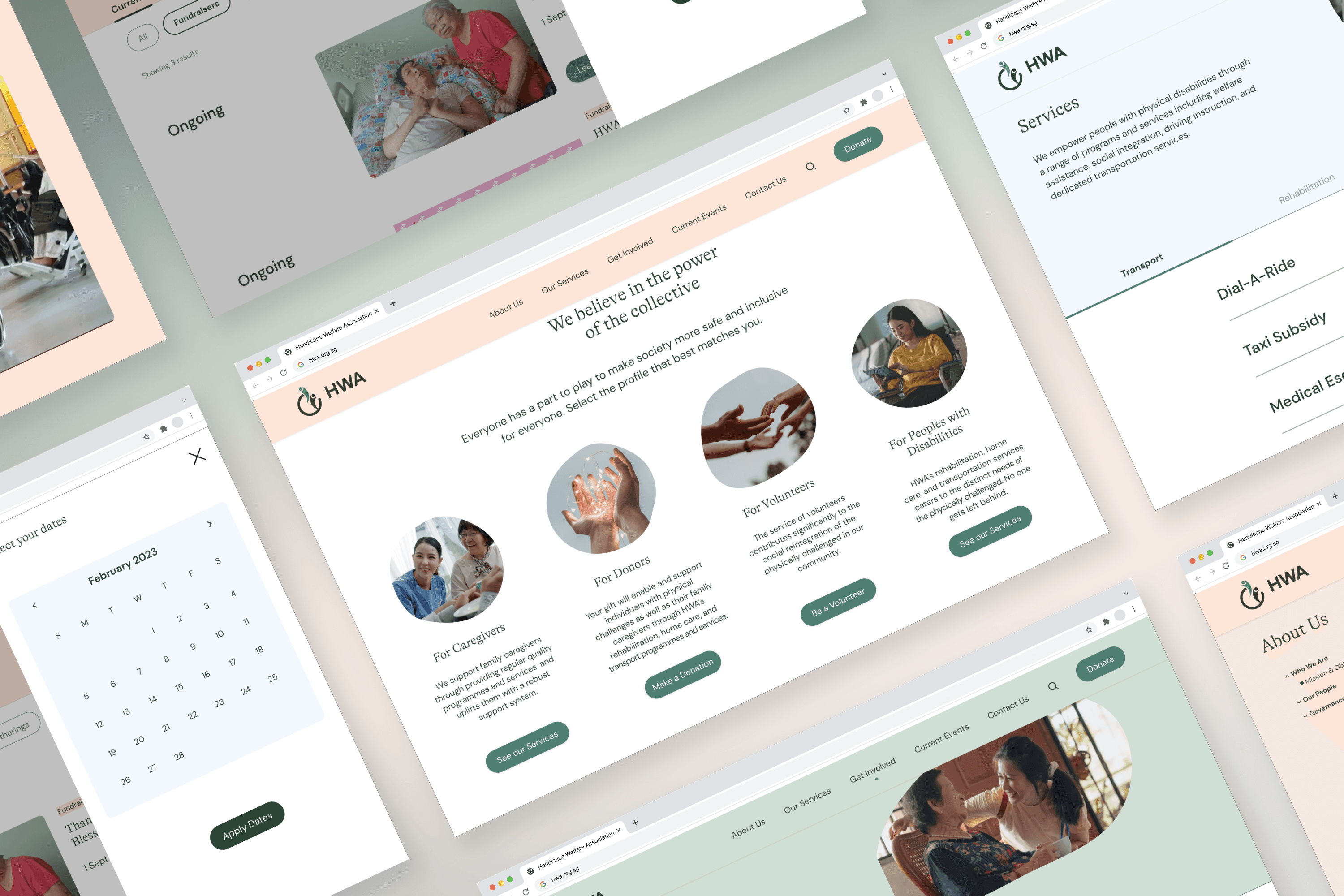
In a team of four, we redesigned a website based on user research, proposing a new IA to facilitate user tasks. Our aim was to achieve an aesthetically pleasing design layout and optimised user flows for usability. We developed a content strategy through a content audit and collaborated with web developers to launch the site.
What are the Existing Challenges?
Current Website
From our user research, we identified issues users faced on the existing website.
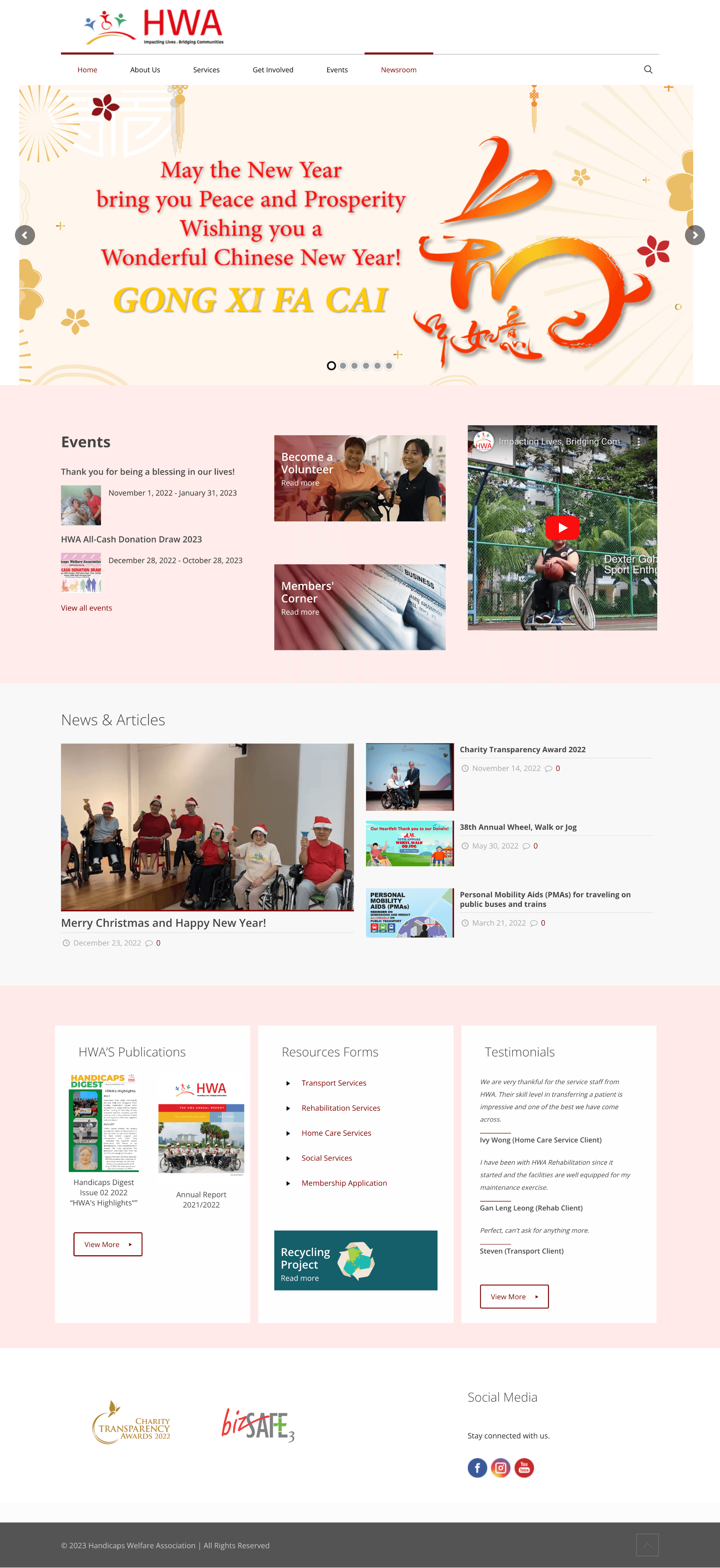
Current Home Page
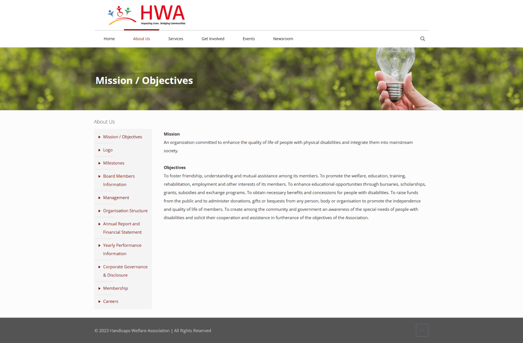
Mission/Objectives Page
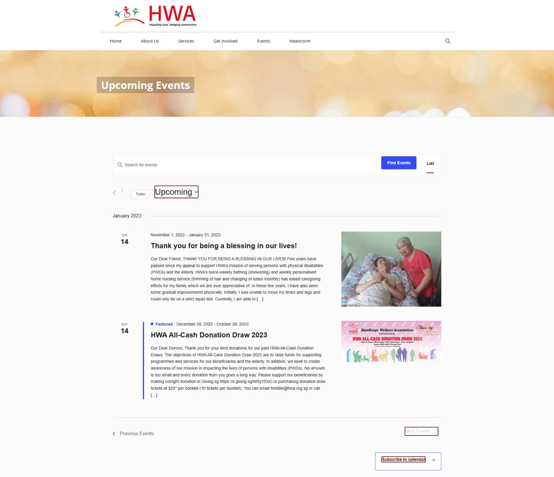
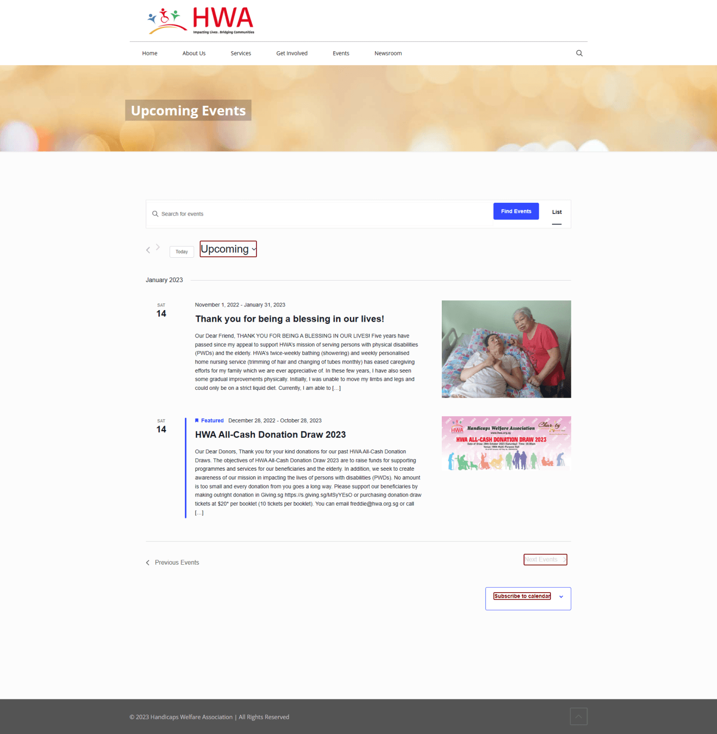
Current Events Page
Home page lacks clear call-to-action.
Home page doesn't communicate who is HWA as a brand.
No hierarchy of information and wall of text is overwhelming.
Mission page is a wall of text with corporate speak.
Events are uncategorised and dates are confusing.
Events is a key channel for social engagement and donations.
Information Architecture (IA)
The current organisational structure can be better optimised by categorising some of the pages as well as moving ‘Contact Us’ to under ‘About Us’.
The most problematic part of the sitemap was the ‘About Us’ section, which consisted of too many subpages, making it hard for the user to read through.
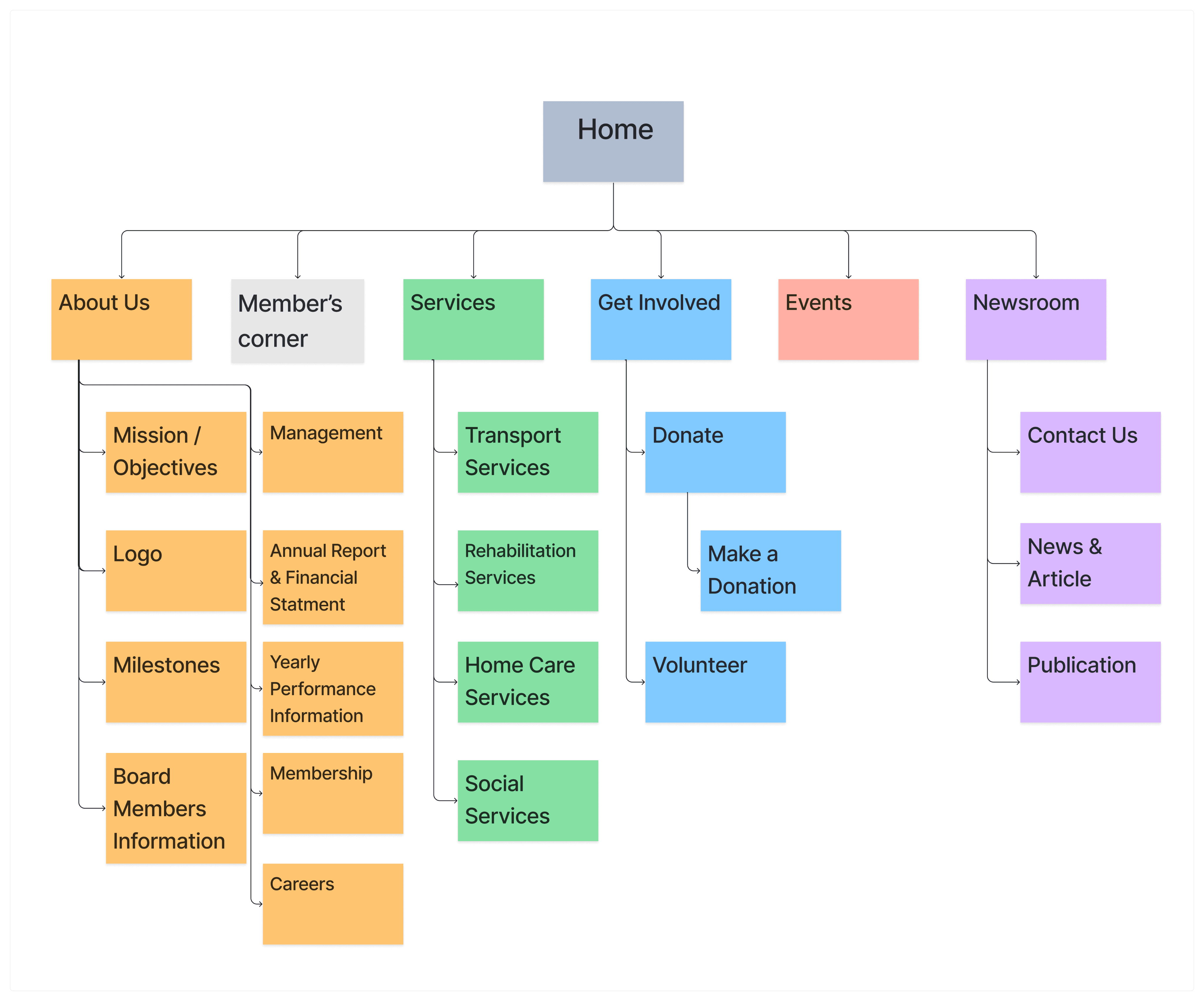
Current Information Architecture of HWA
Our Findings & Problem
Research Insights
We conducted 1 stakeholder, 16 user interviews, 1 fundraiser interview and 1 site visits.
"I want to be able to find what I need quickly on the website."
"I want to feel connected to the cause before I get involved."
"I expect financial transparency from a non-profit organisation."
"I don’t know if clients got improvement after undergoing their services."
"I use the website to fact-check and compare prices of services."
Problem Statement


What do we Proposed?
Proposed IA
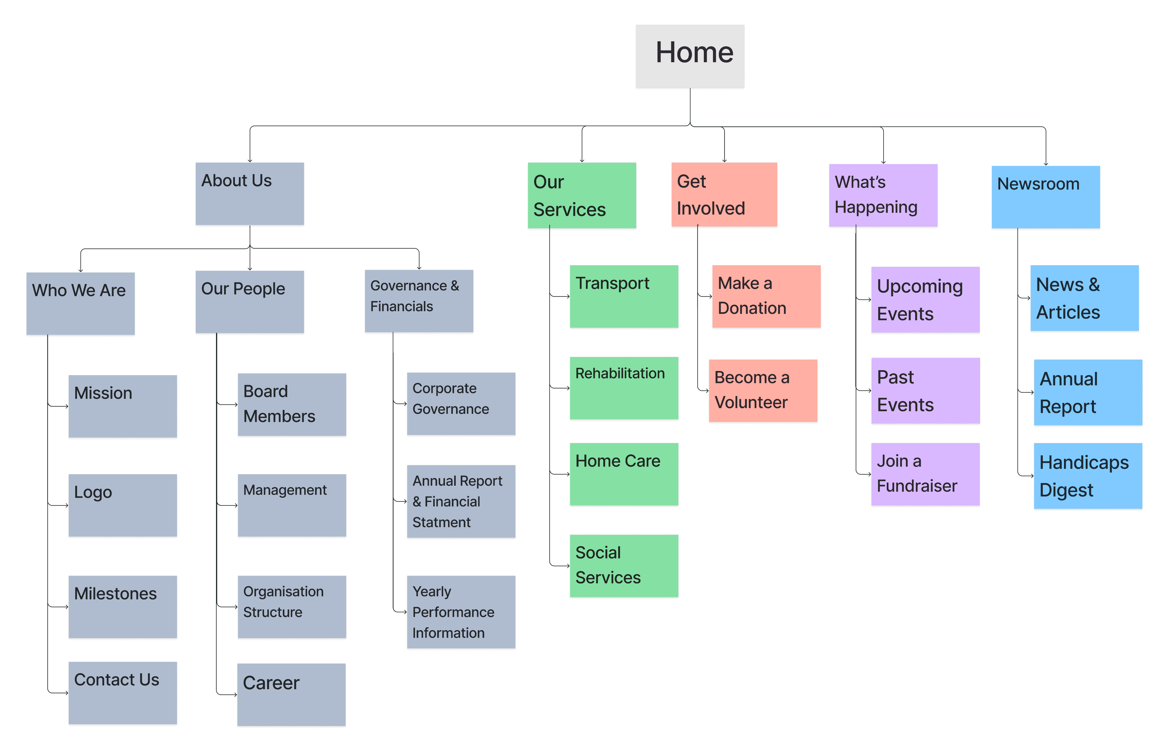
Proposed Information Architecture
Key Changes:
The "About Us" page was further categorised to make it easier for users to find the information they need quickly.
We moved the "Contact Us" page and regrouped it under "Who We Are" for easier access.
We reviewed the current "Events" page to better categorise the information, making it more intuitive and understandable for users.
Content Inventory
We conduct Content Audit using the NN Group template.
Content Strategy
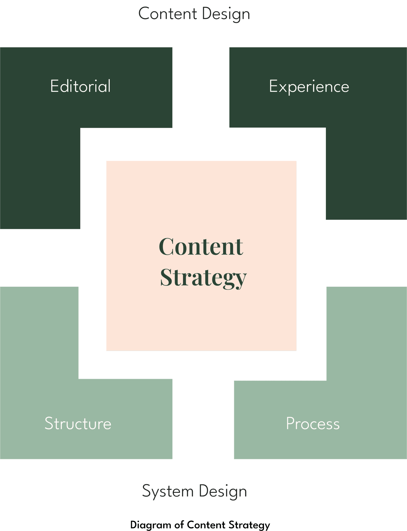
After creating the current and proposed content inventory, we evaluated how to use the existing content to meet both business and user needs.
For Content Design (Editorial and Experience), we set the tone, messaging, and layout to make the site more pleasant and intuitive while considering cognitive load. Ultimately, the goal is to effectively communicate the organization's credibility and mission.
For System Design (Structure and Process), by organising the current site pages to fit into the proposed IA, we aim to improve the checkout process for donations. Visitors should be able to find information easily while navigating the site.
Solutions
1) Ease of finding and filtering information:
Quick links on home page with clear Call-To-Action (CTA)
Allow users to have control over the content through accordions and filters
Before

Current Home Page
After
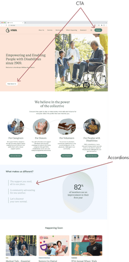
Redesigned Home page
2) Inspire trust and confidence:
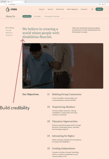
Use the home page to build credibility (statistics, legacy)
Use about us page to create impact (mission statement, video of members)
Before
Current About Page
After
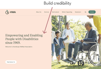
Redesigned Home Page (Top portion)
After
Redesigned About Us Page
3) Highlight the community spirit
Demonstrate HWA's active, inclusive community through showcasing events.
Before
Current Event Page
After
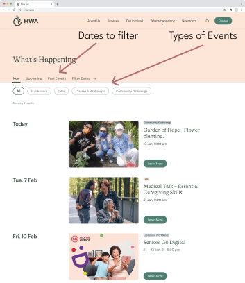
Redesigned Event page
Prototype Development
High Fidelity Prototype
Using Figma, we created an interactive prototype that will be used to showcase our proposed design.
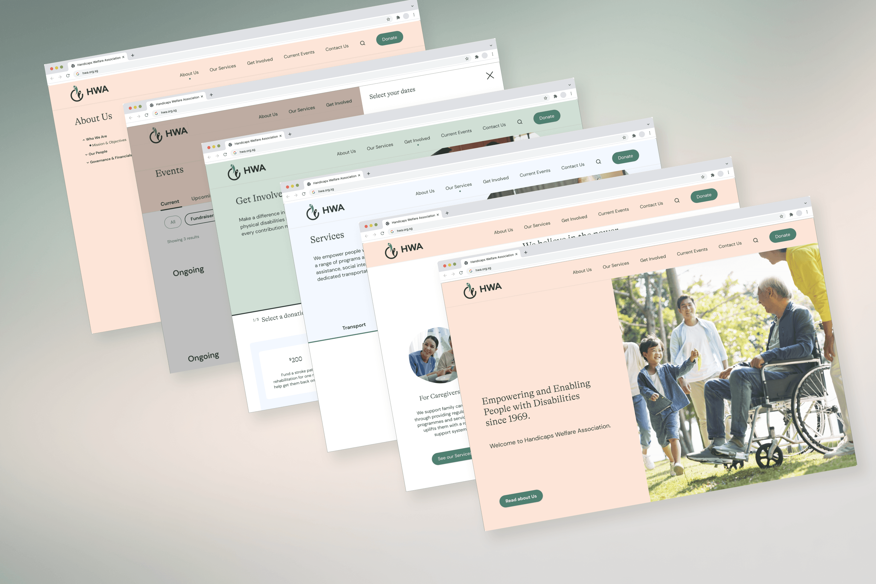
Key Screens
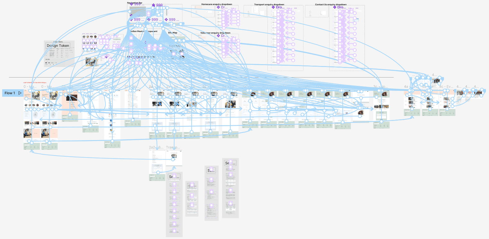
Figma Interactive Prototype
Usability Testing
We conducted multiple iterations of formal user testing using clear and quantifiable metrics for the two versions leading up to the final presented prototype.
The questions were mostly focused on key functions and critical points in the user flow, aimed at addressing identified pain points
Handoff
Future Recommendation
Disclaimer:
To comply with my non-disclosure agreement, I have omitted confidential information in this case study. The information in this case study is edited and may not necessarily reflect the current state of the project.

